
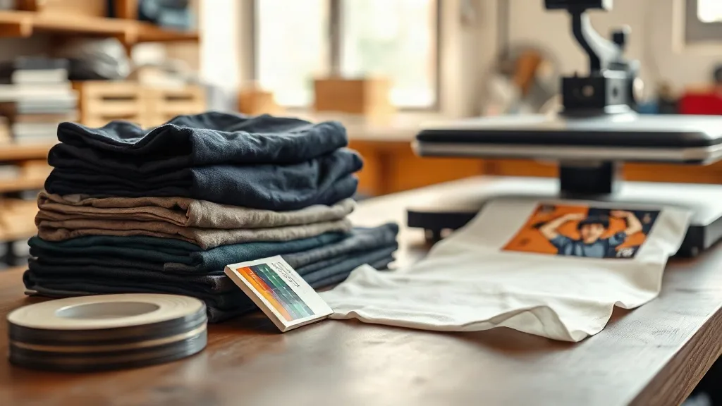
Every print shop has that moment: the digital proof glows on the monitor, the customer approves it in seconds, and then the finished shirt comes off the press looking like a distant cousin of the design. Nine times out of ten the culprit is not the printer, the powder, or the film. It is the shirt underneath. shaka wear blanks are a favorite for good reason, but their cotton and their dye process give DTF ink a personality of its own. Understanding that personality is the difference between a reprint and a repeat customer.
This guide is not about settings you can copy from a label. It is about the color behavior of heavyweight streetwear blanks, why the same transfer file can look bold on one shirt and washed out on the next, and the small adjustments that keep a run consistent from the first piece to the five hundredth.
Why the Blank Decides the Print
DTF transfers are thin. That is the whole appeal: a soft hand, no color limits, no screens. But thin also means the ink sits close to the fabric surface, and whatever the fabric does with light and moisture, the ink does too. On a white poly blend, a transfer reads almost exactly as designed. On a 6.5 oz heavyweight cotton tee in a deep color, the same file can lose saturation, warm up, or go slightly muddy.
Shaka Wear's core line leans toward heavier cotton and cotton-rich blends, often garment dyed or piece dyed in large batches. Heavier cotton has a denser surface, which means the adhesive powder grips well and wash durability is excellent. It also means the fabric absorbs more of the ink's optical brightness, especially in darker colorways. Knowing this before you print saves you from blaming your film.
The undertone problem nobody warns you about
Two shirts that both read "black" on a swatch card can carry completely different undertones. One leans blue, another brown, another green. Put a cool gray or a pastel pink transfer on a warm black tee and the print will look dirty. Put the same transfer on a blue-black tee and it looks crisp. This is not a defect. It is physics.
The practical fix is simple: build a small undertone reference for the colors you sell most. Print a test patch of white, a mid gray, and one brand color on each dark blank you stock, label the swatches by SKU, and keep them on a ring near the press. When a customer sends a design with lots of light tones, you can check the swatch before you commit to a full gangsheet.
Reading Dye Lots Before They Cost You
Garment dyeing is not a photocopier. Every lot has a personality, and heavyweight blanks from any brand, Shaka Wear included, can shift a shade or two between production runs. If you print a 200-piece order across two restocks, you may end up with two slightly different navies in the same box.
Most shops discover this after the fact. A better habit is to treat dye lots like a printing variable:
- Order the full quantity for a single job from one lot whenever possible, and note the lot on the job ticket.
- When you must split lots, print the largest single-lot portion first and keep the second lot for the same design only.
- Photograph each new lot under the same lighting as your swatch ring so future comparisons are honest.
- Flag color-critical jobs, such as team uniforms or brand merch, and request lot consistency at the ordering stage.
This is unglamorous work, but it is the kind of thing that separates a shop that rarely eats reprints from one that seems to live on them.
Building a Gangsheet That Respects the Blank
Color decisions start at layout, not at the press. A DTF Gangsheet Builder lets you pack multiple designs onto one film, which is efficient, but it also means one sheet can carry prints destined for very different fabrics. Grouping by destination helps. Keep light-on-dark designs together, keep pastel and fine-detail work on a separate sheet, and avoid mixing a design meant for a white tee with one headed for a deep navy on the same run if you can help it.
Resolution matters more on textured cotton than on smooth poly. Fine hairlines and small type can break up when pressed onto a nubby heavyweight surface, so give thin elements a little extra weight in the file. A 1 pt line that looks elegant on screen often needs to become 1.5 pt to survive contact with a 6.5 oz cotton face.
White ink laydown and opacity
On dark blanks, the white base layer does the heavy lifting. If your white layer is thin, colors will read gray and dull. If it is too heavy, the print feels like a plastic patch. The sweet spot depends on the fabric's surface texture. On Shaka Wear's heavier tees, a slightly fuller white base usually presses cleaner because the cotton face has enough tooth to hold it without a hard edge.
Run a small ladder test: print the same small design at three white opacity levels, press all three on the same blank, and wash them once. The version that keeps color and still feels soft is your house standard for that fabric family.
Press Variables That Change Color
Temperature, pressure, and time do not just affect adhesion. They affect how the ink film settles into the fabric, and that changes how color reads.
- Too little pressure leaves the transfer sitting high, which can look chalky and wash off early.
- Too much pressure flattens the cotton and drives ink into the weave, which dulls saturation on dark shirts.
- Too much heat can yellow or scorch light colors, especially on natural cotton.
- Peeling cold versus warm changes the surface texture of the finished print.
Treat press settings as a per-fabric decision, not a shop-wide rule. A heavyweight cotton tee and a lightweight blend want different pressure. Keep a simple log taped to the press: fabric, temp, time, pressure, peel temperature, and a one-word verdict. After a month, you will have a reference more useful than any forum thread.
Color Consistency Across a Long Run
Long runs expose every small inconsistency. The first ten pieces look perfect, then the powder station gets humid, the film roll changes, and piece forty looks a shade off. On heavyweight blanks the difference is subtle but customers notice, especially on team orders where every shirt sits next to another.
Three habits keep a run tight. First, check humidity in the print room; DTF powder and film both hate damp air. Second, keep film from the same batch together and open a new roll only between jobs, not mid-job. Third, pull one piece every twenty or so and compare it under daylight against your approved sample, not under shop fluorescents. Daylight tells the truth.
Matching Designs to the Right Blank
The best color result often comes from choosing the blank to fit the design rather than forcing the design onto whatever is in stock. A neon-heavy graphic sings on a white or light heather tee and fights a warm black. A muted earth-tone design looks richer on a garment-dyed blank than on a flat bright one. Vintage-style prints with distressed textures hide small color shifts that would be obvious on a clean vector logo.
When a customer is set on a specific colorway, show them two blank options and one printed sample. A physical sample ends the conversation faster than any mockup. It also protects you: if they choose the harder combination with eyes open, the reprint conversation is much shorter.
Frequently Asked Questions
Why does my DTF print look duller on Shaka Wear heavyweight tees than on a poly blend?
Heavier cotton absorbs more light and has a denser, more textured surface than smooth polyester. The ink film sits closer to that texture, so bright colors lose a little punch. A slightly fuller white base and moderate press pressure usually restore most of the saturation.
Can I print the same gangsheet for both white and black shirts?
You can, but results will vary. Designs with thin lines and light colors often need a heavier white base for dark blanks, while that same heavy base can feel thick on a white tee. Splitting the sheet by destination fabric gives noticeably better results.
How do I handle a customer order that arrives across two dye lots?
Print the largest single-lot portion first, keep the second lot for the same design only, and photograph both lots under daylight. If the shift is visible, tell the customer before printing rather than after delivery. Transparency here prevents most complaints.
Does washing change DTF color over time?
The print itself is durable, but repeated hot washes and high dryer heat can slowly dull the surface, especially on dark garments. Recommending cold wash and low heat drying keeps color closer to the original for much longer.
What is the fastest way to test a new blank before a big order?
Print a small patch with white, gray, and one brand color, press it at your standard settings, and wash it once. That single test tells you more about how the blank will behave than any spec sheet.
Putting It All Together
Color on DTF is a partnership between ink and fabric, and heavyweight streetwear blanks bring strong opinions to that partnership. Build a swatch ring, track dye lots, group your gangsheets by destination, and log your press results. None of these steps is dramatic, but together they turn color from a gamble into a process you control. That is what keeps a print shop's reputation clean, one true-to-proof shirt at a time.